Posts

EXP 3 Custom Textures

Image

EXP 3 Lumion

Image

EXP 3 Sketch Perspectives

Image
The basic, square blocks Blocky yet defined Sharp, simple and menacing Clunky, with purpose Deceptively simple, frail Thin, regal and square

Link to 3D Warehouse for Experiment 2 https://3dwarehouse.sketchup.com/model.html?id=60cd4a5a-1bfb-4d43-998a-fed5d5b25b6b&uploadsuccess=1

https://3dwarehouse.sketchup.com/model.html?id=60cd4a5a-1bfb-4d43-998a-fed5d5b25b6b&uploadsuccess=1

Experiment 2 Lumion pictures, sketchbook drawings and concepts

Image
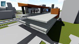
 This view shows the curved roof, as well as most of the conceptual evolution in the sketchup photo.  This is the concept I based my rail on, I started with this as the base and created a rail station from it.  The boxy feel from the concepts is very relevant, we can see how this relates to the concept I ended up choosing to work with.  The pillar and layer idea from my concepts is clear, we can see the adaptation in the work.

zaha and ma concepts

Zaha Hadid Uses up a lot of horizontal space, prefers width to height Looks to be wave inspired, feels like flowing water Uses curves to make the building flow, no straight edges feels like she dipped her finger in paint and smeared it across a page no part of the building feels irrelevant, there are no individual parts to the building Ma Yansong looks to be inspired by water fountains, flowing water incorporates natural elements into his ideas, almost creating nature as an architecture treating architecture as a landscape nature looks to be the main inspiration, his concepts include plants and trees a lot environmentally symbiotic